Processing Services Landing Page
Tools used in this project:
Kloeckner Metals not only provides all kinds and types of steel to their B2B customers - Kloeckner Metals offers a variety of metal processings that allows customers to receive their customised materials ready to be implemented in their final product.
Until 2022, the only way for a customer to get information about these kind of services was via phone or e-mail. As the Online Shop was growing, there was space for a detailed series of landing pages to properly inform their business partners about all existing processing services Kloeckner Metals has.
Collecting.
This request came from Kloeckner Metals Germany. The services were already being provided for a long time before the landing pages, but it was a very complicated information to get - mostly because it came usually with a lot of technical and superfluous information to a user that their only concern is getting a budget and make it done.
That’s when me and the marketing team came along to find a design solution for it in the Kloeckner Metals Germany’s Online Shop and spread the information through social media and newsletters to previously registered clients.
First step was to understand what was the business need and to collect all the information we needed about these services.
The goal was set: Promote the processing services Kloeckner provides in the online shop to incentive users to buy & finalize their products with Kloeckner.
Getting the hands dirty.
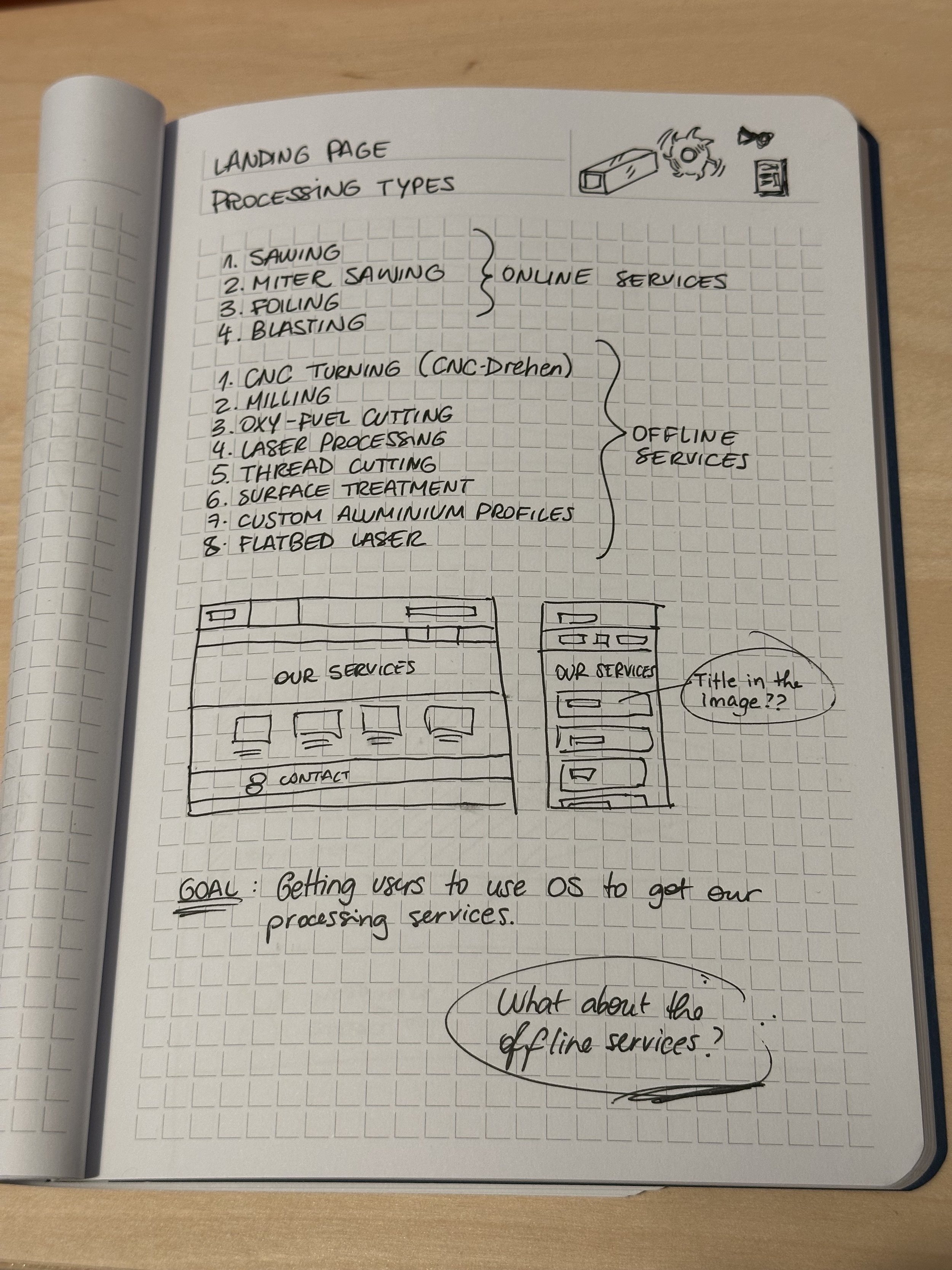
After setting clear goals, collecting all the information about each service and defining the hierarchy of services, it was finally time to dive myself into wireframing.
To get the first ideas off my head, I use to doodle everything: good and bad ideas, no matter how they are. It helps me clear my way into the viable options for this project.
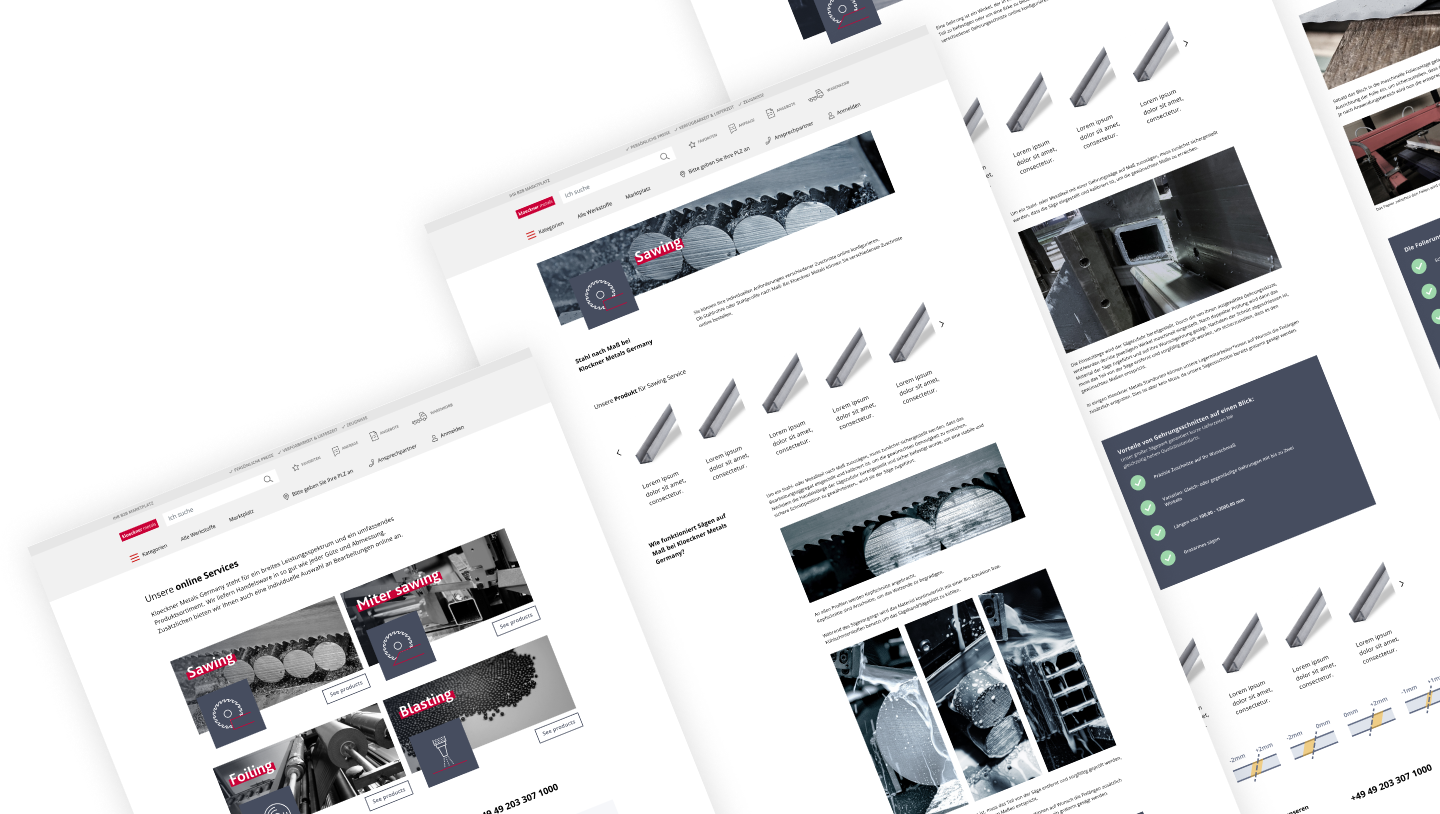
After sketching some low-fi wireframes, it gave me enough ideas to start recreating them into Figma. While my co-worker was finding all precise pictures of the machines and finalised products after being submitted to the processing services we had, I could use all her findings and implementing them into my drafts. As the pictures are very hard to get (the machines are tremendously specific in their services, all of them placed into dangerous zones in warehouses), I had to start adding them into my mid-fi wireframes so we could find out how viable was to use real pictures.
To make sure I didn’t create impossible design elements into the website, I checked different landing pages we had already online so I could make sure I was creating something possible for our developer. That way, I could manage and elaborate components that already existed and stay consistent with our brand and UI style.


Refining.
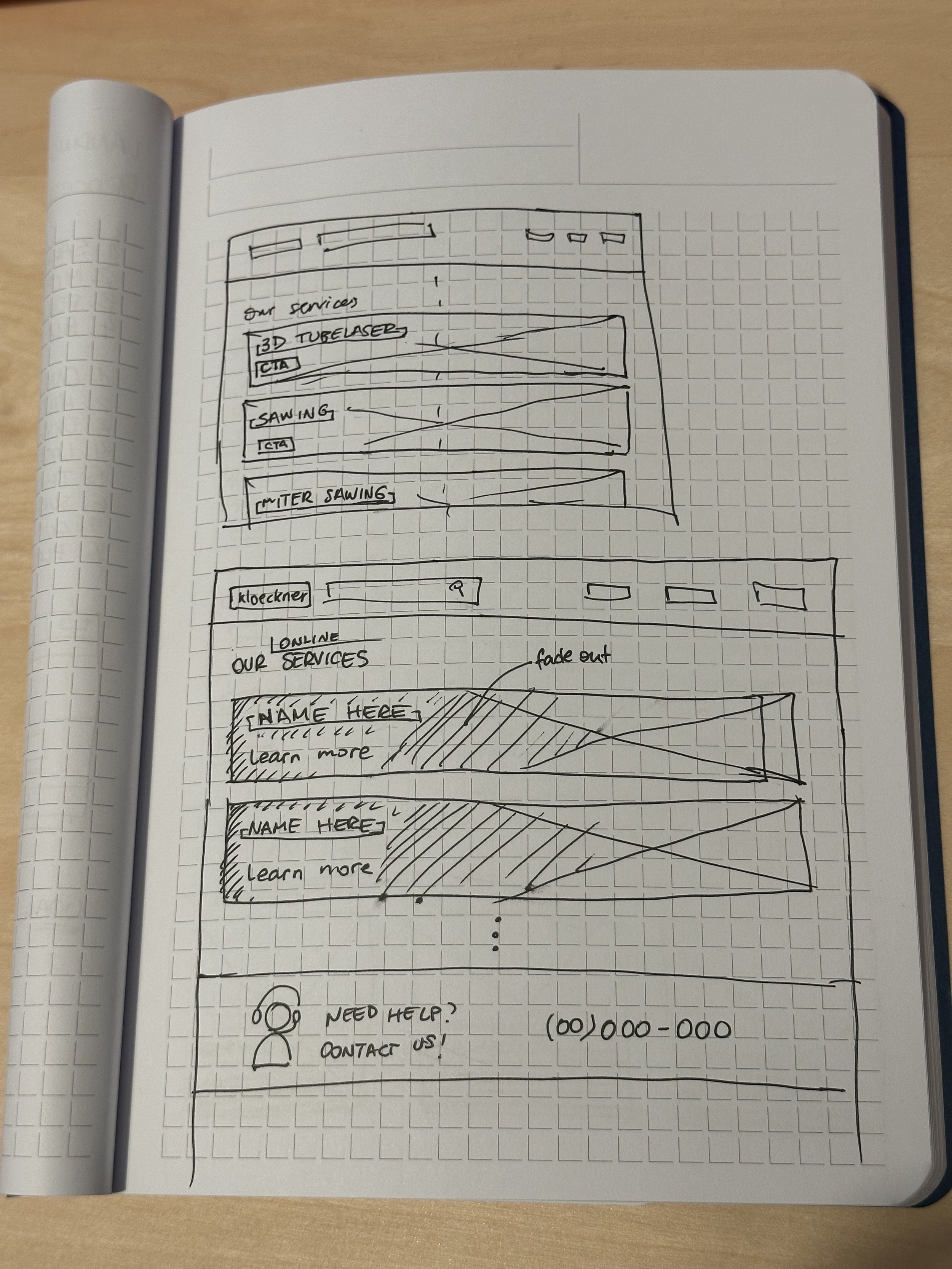
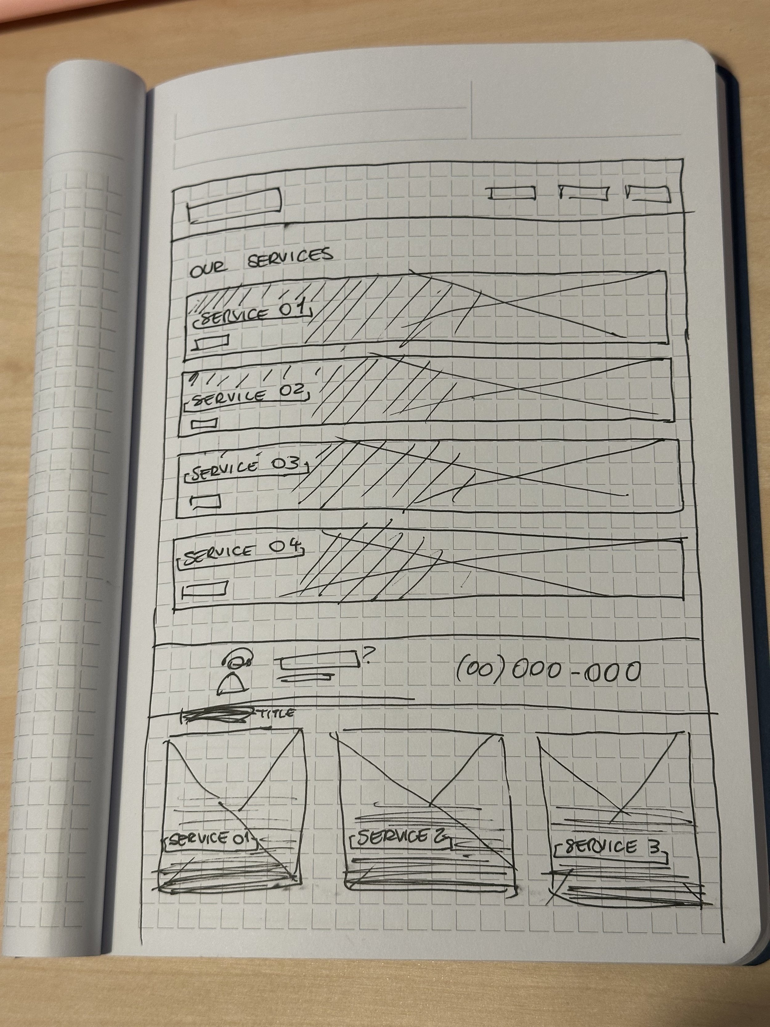
After a few brainstorm rounds, I managed to filter everything down to three options.
I stood away from horizontal elements in desktop screen, as it takes a lot of white space and the user can’t visualise the four main options at first glance without scrolling down. So I opted for a two column grid where all the user needs to know at first is right there.
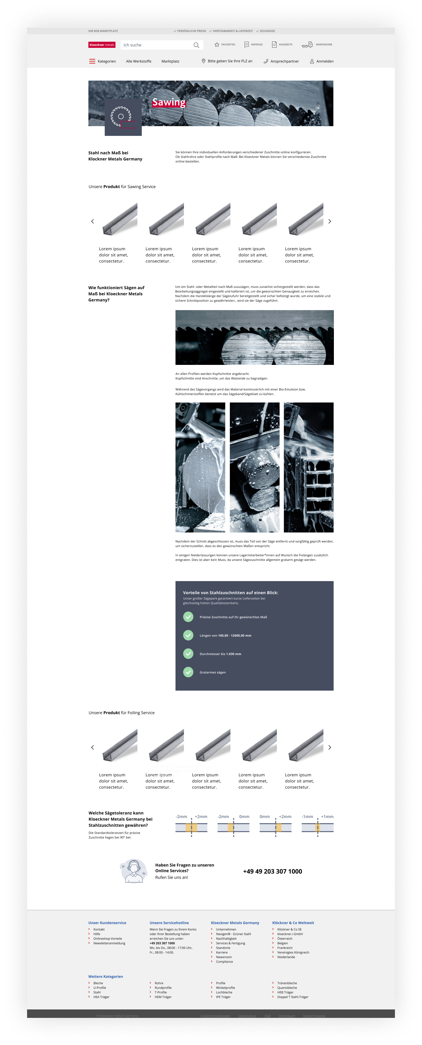
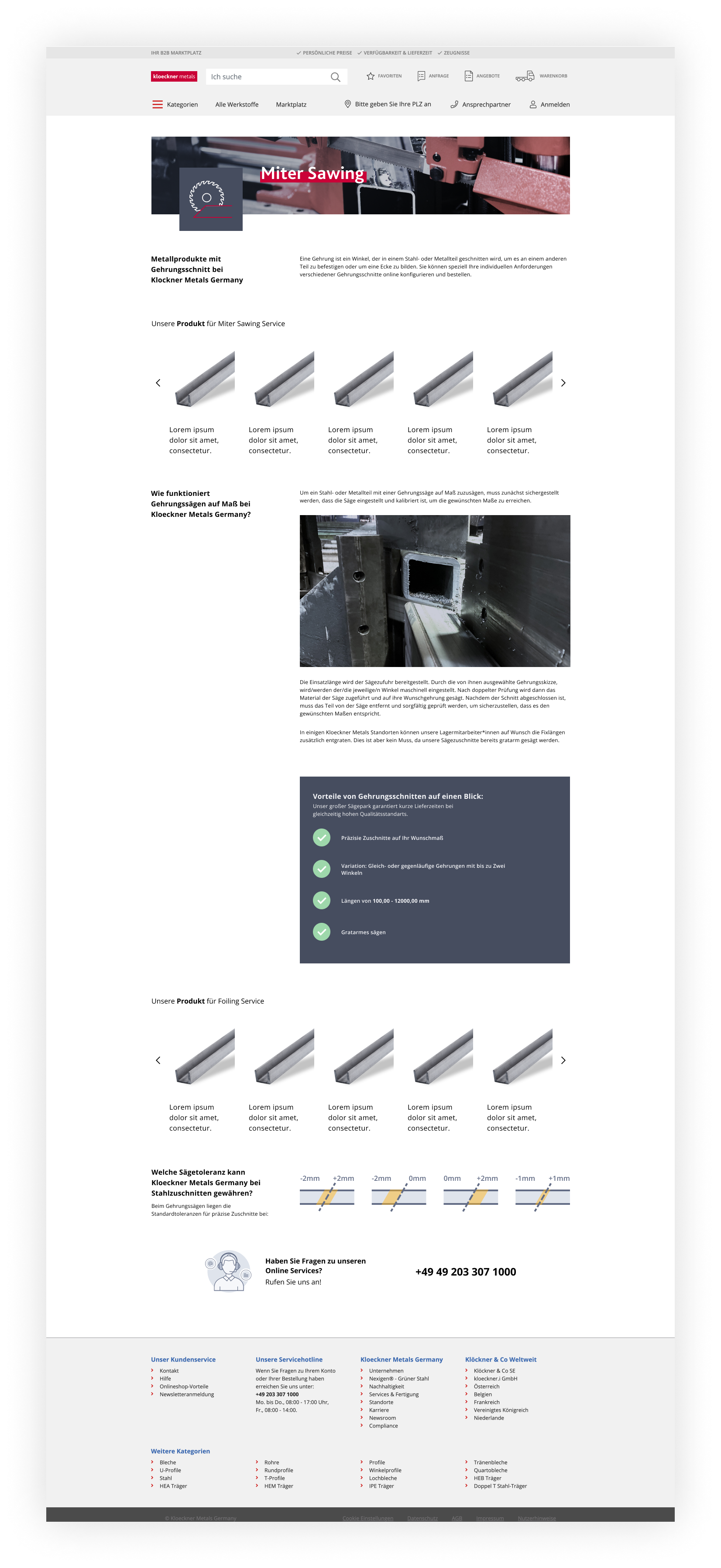
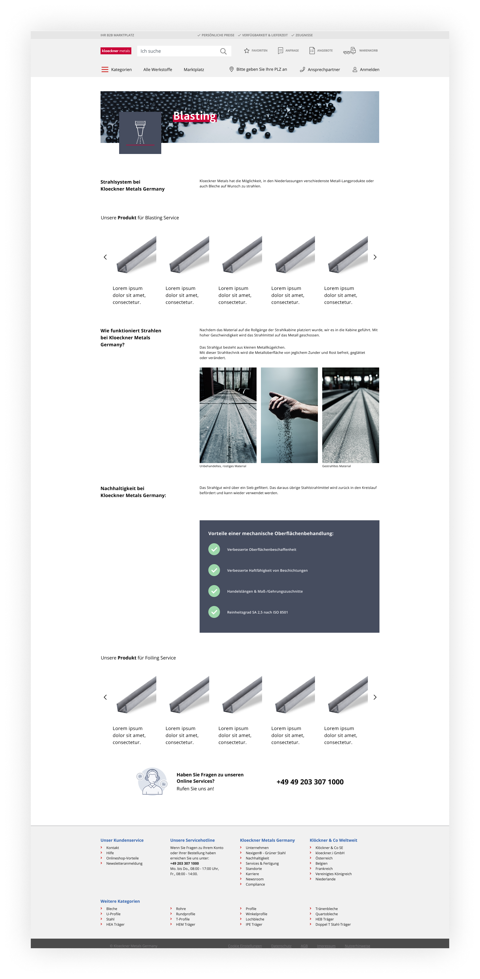
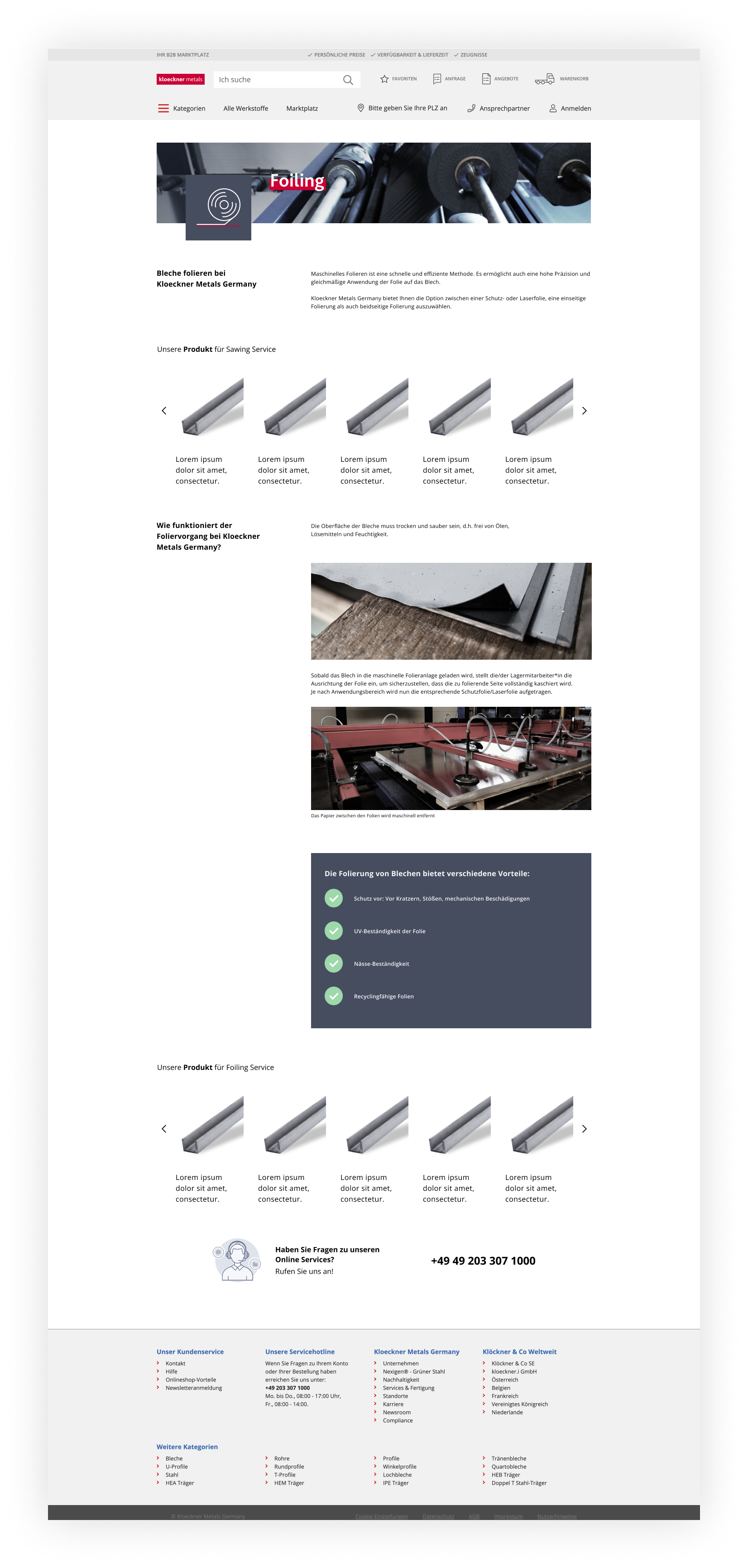
The division works like this: First section you can find the main four processing services Kloeckner promotes and offers in the online shop. The other six services were not available at the time to get them online - so we list them as possible services and a contact information explaining how to get them.
For the pictures, each one of them were taken by different photographers and in different settings and time. This was extremely challenging to make it fit as a whole in the main Landing Page - I took one of the pictures and spend an entire day fixing the lights and colours on Adobe Photoshop, creating a filter that could work in all of the other ones. Once I got a very good setting, I edit each one of them so it could work together as a whole.
As the pictures were in high quality and approved, I decided to use both picture and icon in the landing pages. In that way, even if more services get offered online in the future and the pictures are not perfect, the icon would illustrate it just as well. The icons were draw on Adobe Illustrator.
The version 02 were the favourite one among the team.

Wrapping things up.
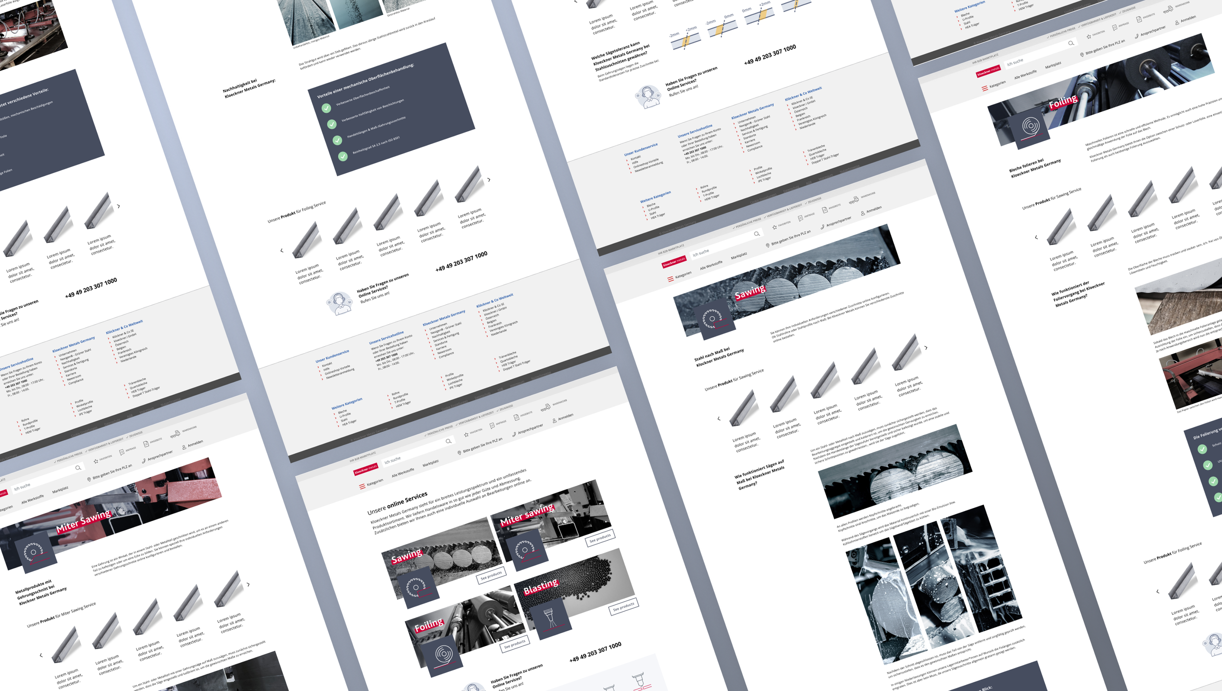
Next step was to properly build the Main Landing Page and prototype it for the developer in charge. While he was coding it, I could start designing the Content Landing Pages - one complete page for each of the four main services.

Check it out online!
The implementation was as smooth as possible and this project it is now online! You can check the pages by yourself here: