DU Pride e.V. Logo
DU Pride e.V. is an LGBT+ association from Duisburg - DE.
In the past, they were known by a different name and didn’t have a proper branding.
For this year (2024), DU Pride e.V. wanted to redesign their logo.
Tools used in this project:
Everyone has a past.
As a dedicated association, DU Pride e.V. takes the lead in orchestrating the annual CSD Duisburg event. Being much more than “gay” or “lesbian”, the community felt the need to change their old name - and with it - an opportunity to redesign the logo so the whole LGBTQ+ collective is much better represented.


What else it’s out there?
For starters, it was crucial to familiarize myself with different associations within Germany and what kind of logo they used.
They were simple and very clear, although none of them quite reflected their own city - So all of them looked very similar.


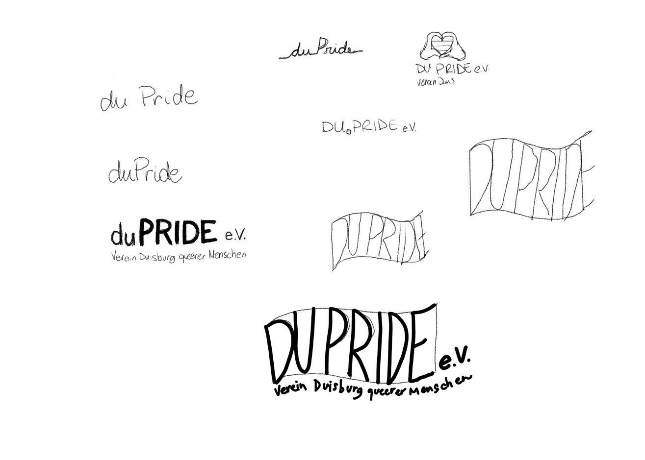
We all have to start somewhere.
To get the basic ideas out first, I started doing sketches - at this stage, there’s no right or wrong.
First I used plain paper and pencil, then I scanned and refined a bit some of the best options on Adobe Illustrator. After collecting a few opinions with some designer colleagues, I managed to filter down my potential logos. I still wanted to create something interesting using the Duisburg sculpture, so I started doing more sketches from pictures of the artwork.
The biggest challenge at this stage:
Create something unique for Duisburg and making sure that the pride flag were inclusive enough, as today we have many flag variations that could contain more than 13 colors.

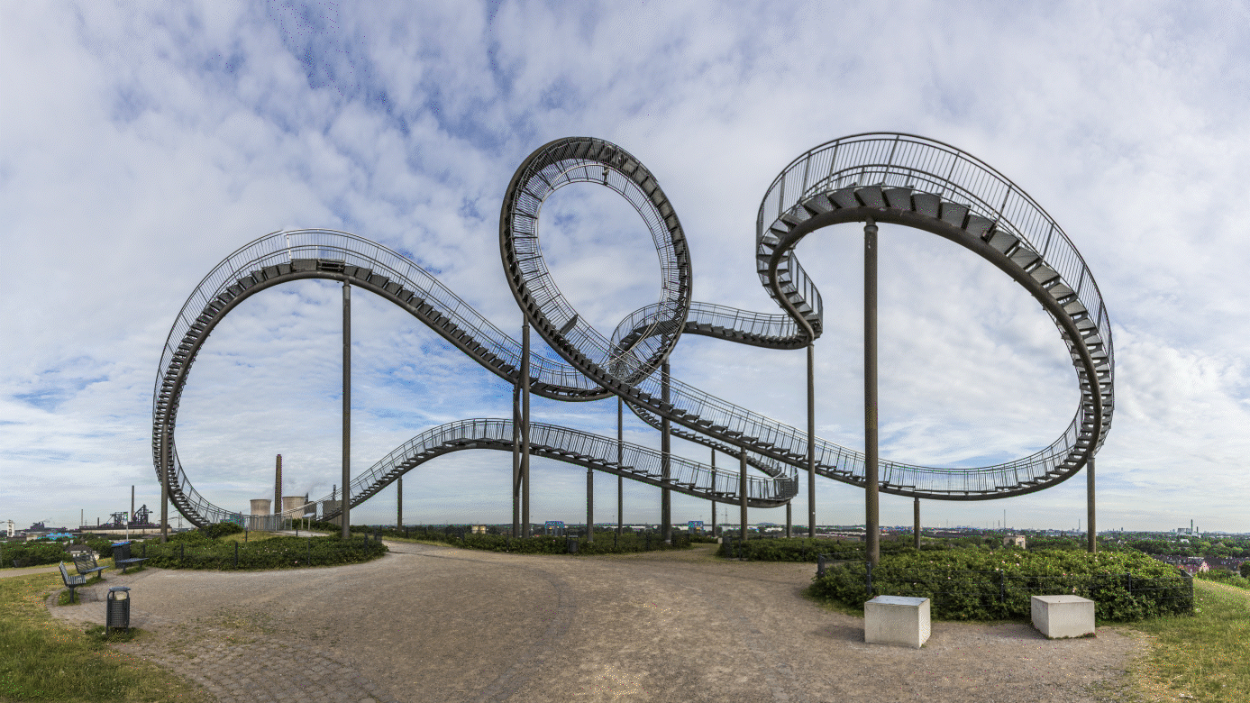
Then I came across with this sculpture
Tiger & Turtle - Magic Mountain is a sculpture and public art installation in Duisburg, Germany. It is not a traditional staircase but a spiral sculpture resembling a roller coaster. Created by artists Heike Mutter and Ulrich Genth, the artwork was unveiled in 2011. The structure provides visitors with a unique perspective of the urban landscape and has become a popular attraction in Duisburg.
After my research about this sculpture, I was decided to use it, somehow.
It was hard to get the right angle of the Duisburg sculpture and make the lines being harmonic and simple, making sure the essence of the art was still recognizable in the logo. After a few attempts, there was a certain angle in the picture that allowed me to get the right balance on my sketch.
For this, it was crucial to use Adobe Photoshop - it gave me a lot of flexibility as I was testing different pictures of the sculpture during the sketch phase. After I got the right angle, I moved on to Adobe Illustrator again so I could vectorise the drawing, making sure that even though there’s a lot of curves, the logo doesn't look too overwhelming.


Let’s dive in
At the end of my process, I managed to prepare a deck with 3 options where the DU Pride e.V. association could choose from.
The presentation was created on Adobe InDesign and exported as a PDF.
The PDF is available to consult under request.
THE FLAG OPTION

This draft presents a bold typography, creating the feeling of being proud of who you are.
The colors and angle creates the illusion of a waving flag. The angle also shows that the community is not part of a rigid/conservative society, but it breaks the rules. Instead of “DU”, we use “Duisburg”, as there’s no reason to have a short version of the name.
Why try to avoid the obvious? People easily recognizes the pride flag, and the right association to the logo is made. This approach was the safest option.
The fonts used here were Archivo.
THE TYPOGRAPHY OPTION
DU Pride is the brand design's name dream. It's short and strong, which makes it easy to come up with lots of ideas. So in this approach I tried to explore using the typography, as the strength of the logo is in the name.
So as you can see, the focus comes back to the name - the flag colours are represented inside “pride“. The font used here creates a perfect balance reflected on the “D’s” and “P“.
It is a short logo, perfect for applications on all sorts of media.
The fonts used here were MuseoModerno and NanumGothic.

THE TIGER & TURTLE OPTION
Inspired by the Tiger & Turtle in Duisburg. Based on the fun and dynamic shapes of Tiger & Turtle, the logo contains a very unique symbol of the city combined on a gradient colors of the pride flag.
The fonts used here were MuseoModerno.